Setting up your event site content
Last updated: May 20, 2025
🧑🏭 We’re still working on these instructions. Just contact us if you need instructions that you didn’t find in this section.
Videosync event sites are built of modules. Display of the modules is controlled with on/off toggles in event admin, and the content and appearance is set in each module’s settings. Available content modules are: General page background, Page header, Event description area, Link grid, Event schedule and Attachments.
💡 Content modules are set and controlled in Preparation —> Event site set up
Quick navigation links
General settings
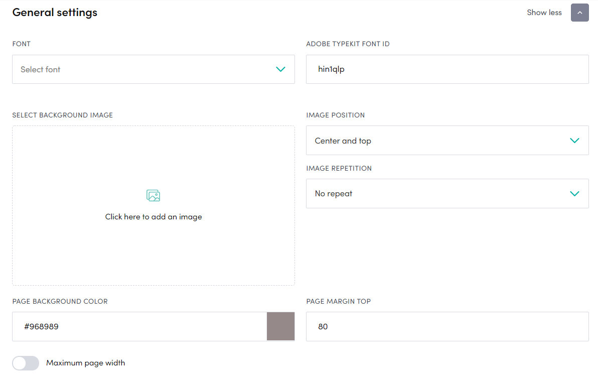
In the general settings, you can adjust overall look and feel of the event site.
- Font sets the font to be used in the event site. If you want to use a font that you can’t find in the Videosync -library, please import fonts in the Custom CSS settings.
- BACKGROUND IMAGE refers to a image that is set as a background for the whole event site. Just click and browse to add image, then adjust the image position and repetition settings next to the background image setting.
- PAGE BACKGROUND COLOR is used to set a certain background color for the event site. Type RGB color, for example rgb(255,222,225) or HEX, for example #6f5a5c - alternatively click the color picker area on the right side of the field and choose the desired color.
- PAGE MARGIN TOP you can adjust this if you want to leave some space in the top above the page header area
- MAXIMUM PAGE WIDTH you can use if you want to limit the width of the event site. Just click the toggle on, and fill in max width in pixels. If you have the toggle off, the event site will try to use all available browser width for the event site (which may cause issues in 4K or higher resolution displays, so we’d recommend to set a max width)
Page Header
Page header is the area on top of the event site, typically used for event organizer logo and event title. Remember to set the toggle on, if you want it to be visible in the event site.
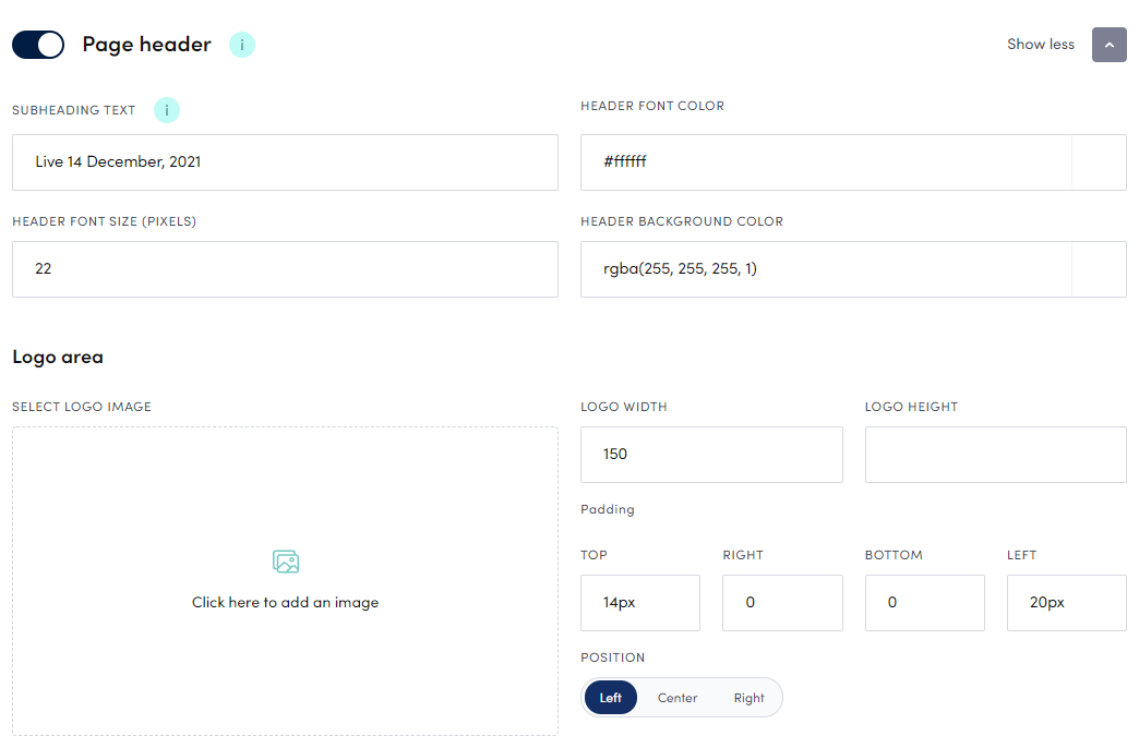
- SUBHEADING TEXT is another text area in the header. Event title defaults to the left side (after logo) while the subheading text default position is on the right side of the header area. Can be used for example to display date and time of the event. Just fill in the desired text in the text field.
- HEADER FONT COLOR sets the font color of the header text. Type RGB color, for example rgb(255,222,225) or HEX, for example #6f5a5c - alternatively click the color picker area on the right side of the field and choose the desired color.
- LOGO IMAGE just click on the Click here to add an image area to add your logo, or some other image, to the event site header. See animation below how image can be added and modified. After logo has been selected, you can adjust logo width, height, padding and position in the handles on the right side of the logo image area. To change the logo, just click on the image and the logo picker tool opens, to remove or change selected logo.
Event description area
Event description area is basically a free content area, where you can have just a simple event overview, or more complex content. In the sample below, this area has been used to show presenter bios and a Calendly book-a-meeting form.
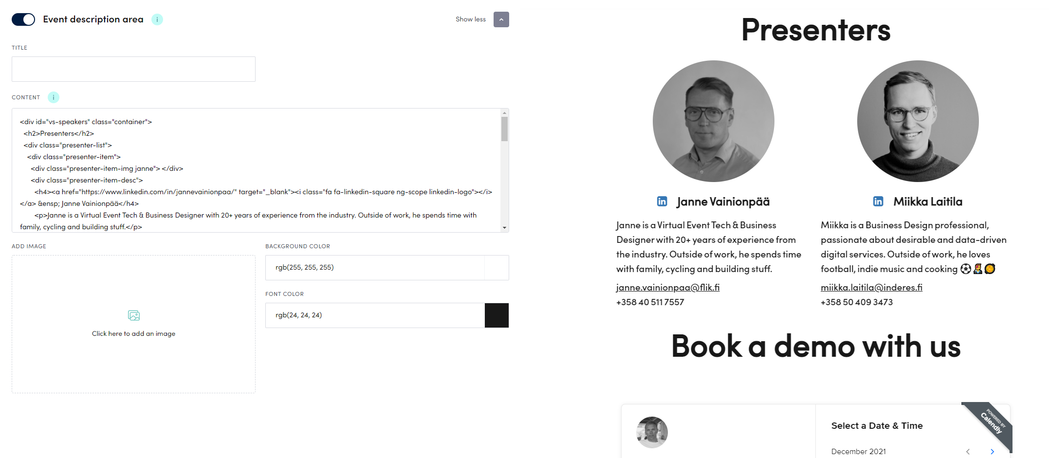
- TITLE is a text area above body content. Just type in the desired title here. “About this event” for example.
- CONTENT can contain text or if you like to do something more advanced, you can use HTML (as in the sample above has been used).
- IMAGE inserts selected image to the content area.
- BACKGROUND COLOR sets a colored background for this area. Use color picker to define background color.
- FONT COLOR sets a font color to be used in this specific area only.
Link grid
Link grid is a handy way to add links to content related to the event - blog posts, articles or call-to-actions. Links can include an image as well as a description text, and in Videosync there are different look and feel templates for this module. Number of links, and number of links in one row can be easily adjusted from the settings. Example of a link grid area in action below.
💡 See animation below to see how content is added to the link grid
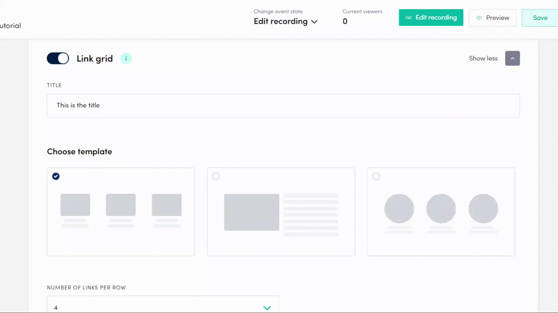
Link grid fields explained:
- Title is the title field. Just type in the desired title text.
- Choose template lets you decide how the links are visualized. Currently three options to choose from.
- Number of links per row sets how many content links are shown in one row.
- Font color sets the font color for link descriptions.
- Background color sets the background color for the link grid area.
- Add another card use this to add a new link.
- Link image, Link URL & Link text Use these fields to define settings for each link.
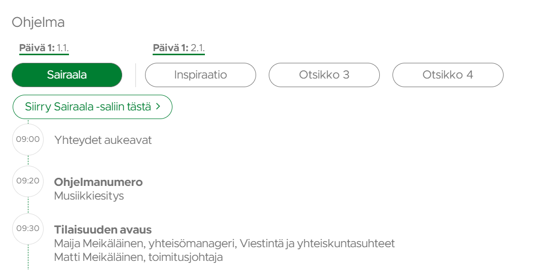
Event Schedule
With Event Schedule module, you can create indexable schedules. Schedule can be shown in the event site as it’s own section (as in picture below) or connected to the video player as a dropdown menu. When doing a live event, schedule items can be timed to the livestream, and will be automatically added as indexes in the recording.
💡 To start adding topics to event schedule, just click on Add another topic in the Event schedule view
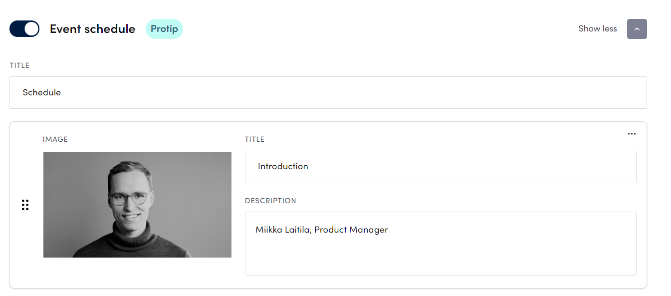
- TITLE field just below Event schedule headline refers to the section title, which is shown as a header to this area in the event site
- IMAGE is voluntary, you can upload it, if you want to show speaker images or some other image fitting to the context (such as a screen capture image in a tutorial)
- TITLE in the schedule item is typically presentation headline, sometimes including also the clock time. For example, 9.00 Opening of the conference
- DESCRIPTION contains typically speaker name, title, or some other text fitting to the context When you are done adding the schedule, remember to click save. All the added items appear also in the Live tool, and can be then added as index points when doing the live event. Read more about the timing procedure from the Live tool instructions.
In the advanced event schedule settings, you can adjust section appearance.
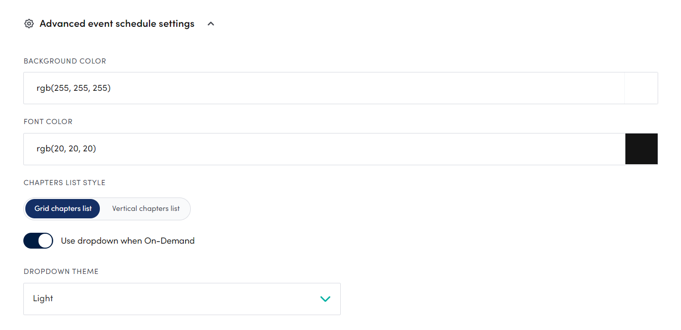
- BACKGROUND COLOR refers to the section background color.
- FONT COLOR is the font color for all texts in this section.
- CHAPTER LIST STYLE contains two options: Grid and Vertical list. Is you have selected Grid, the schedule will be displayed as a horizontal grid list. And Vertical list displays the items, well yes, as a vertically aligned listing in one column. Typically the vertical list is used for event schedules that contain only text items.
- USE DROPDOWN WHEN ON-DEMAND toggle moves the schedule right below the video player as a dropdown menu. If this toggle is off, timed event schedule indexes will be shown as own section in the event site.
- DROPDOWN THEME with two options, Light and Dark. Select best fitting version for your event site look and feel.
Attachments
With the Attachments module, you can easily create a Downloadable documents area in your event site. The look and feel in this module is per default fairly simplistic, not taking a lot of space in the event site.
- If you want to track, which participants have downloaded attachments, set Track attachment downloads toggle on and click save (note that this currently applies only for attachments that have been added after this toggle has been set on). If this toggle is on, each attachment download can be found from the Dashboard. See How to use analytics dashboard for further info about the analytics.
- To add an attachment, just click Add attachments button.
- Choose file that you want to have as a downloadable document in the event site
- Fill in Title to be visible for the audience
- Repeat if you want to have more attachments
- Adjust appearance of the Attachments module by choosing Font color, area Background color, Hovering background color (color when mouse-over) and Font size
Did we miss something? Not to worry! Just email our support team at support@videosync.fi ✌️
Can't find what you're looking for?
Our AI assistant is here to help you find the information you need.